- Components
- aspect-ratio
Aspect Ratio
Utility component to maintain specific dimensions for images or videos.
Demo
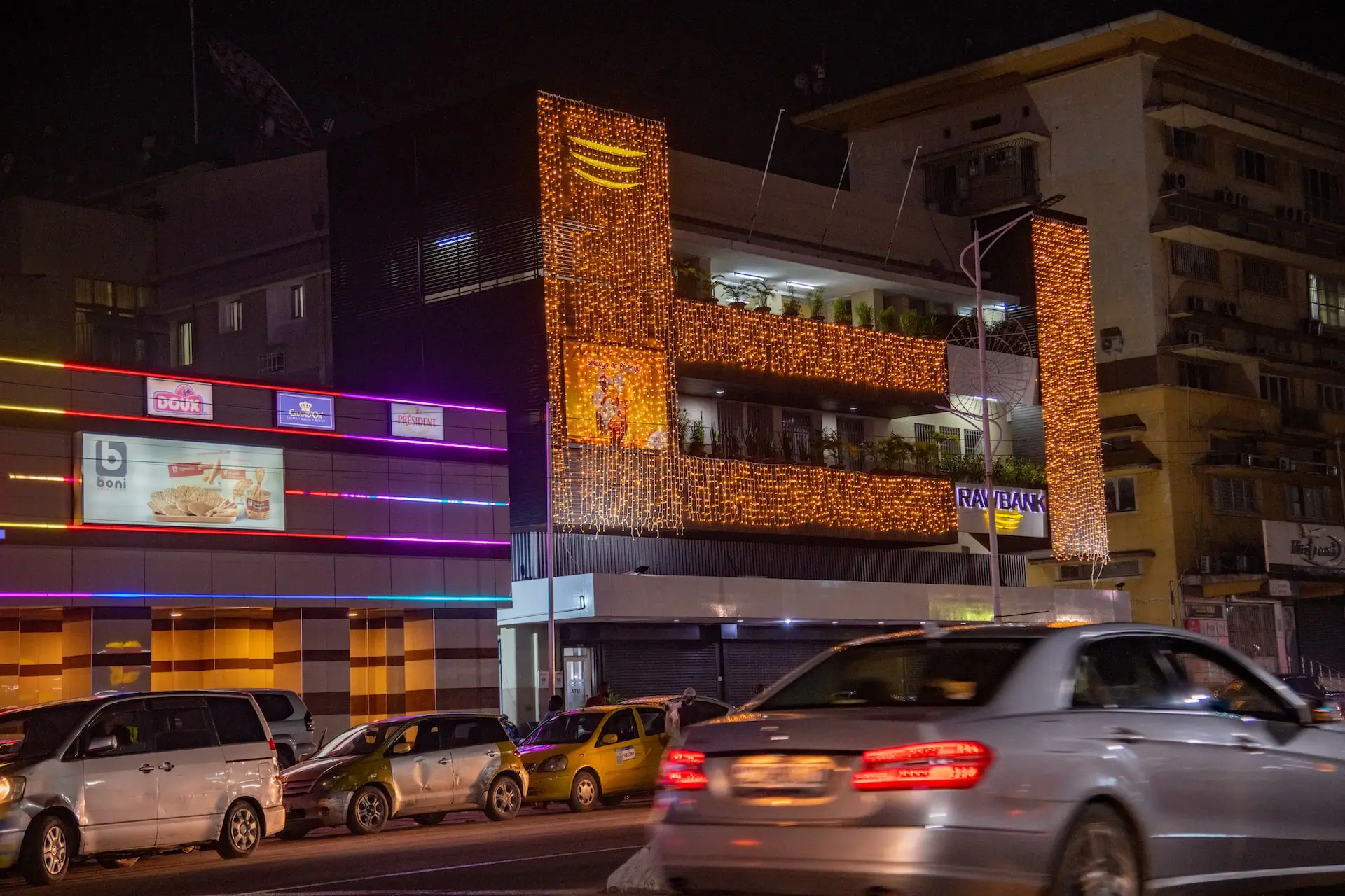
<x-ui.aspect aspect="video">
    <img src="/images/img2.webp" class="w-full h-full object-cover rounded-lg" width="2400"
        alt="Image by Johnnathan Tshibangu" loading="lazy" decoding="async" fetchpriority="low">
</x-ui.aspect>
Installation
Shell
php artisan flexi:add aspectExamples
Square
<x-ui.aspect aspect="square">
    <img src="/images/img2.webp" class="w-full h-full object-cover rounded-lg" width="2400"
        alt="Image by Johnnathan Tshibangu" loading="lazy" decoding="async" fetchpriority="low">
</x-ui.aspect>
Video
<x-ui.aspect aspect="video">
    <img src="/images/img2.webp" class="w-full h-full object-cover rounded-lg" width="2400"
        alt="Image by Johnnathan Tshibangu" loading="lazy" decoding="async" fetchpriority="low">
</x-ui.aspect>
Standard TV
<x-ui.aspect aspect="standard-tv">
    <img src="/images/img2.webp" class="w-full h-full object-cover rounded-lg" width="2400"
        alt="Image by Johnnathan Tshibangu" loading="lazy" decoding="async" fetchpriority="low">
</x-ui.aspect>
35mm film
<x-ui.aspect aspect="35mm-film">
    <img src="/images/img2.webp" class="w-full h-full object-cover rounded-lg" width="2400"
        alt="Image by Johnnathan Tshibangu" loading="lazy" decoding="async" fetchpriority="low">
</x-ui.aspect>
Ultra wide
<x-ui.aspect aspect="ultrawide">
    <img src="/images/img2.webp" class="w-full h-full object-cover rounded-lg" width="2400"
        alt="Image by Johnnathan Tshibangu" loading="lazy" decoding="async" fetchpriority="low">
</x-ui.aspect>
References
Props
The aspect ratio component accepts the following props. The aspect
prop is required.
| Prop | Type | Default | Description |
|---|---|---|---|
aspect
|
string | 'video' |
The container ratio. Predefined values include
video
, square
, 35mm-film
, standard-tv
, and ultrawide
.
|
class
|
string | '' |
Additional classes for the ratio container.
|